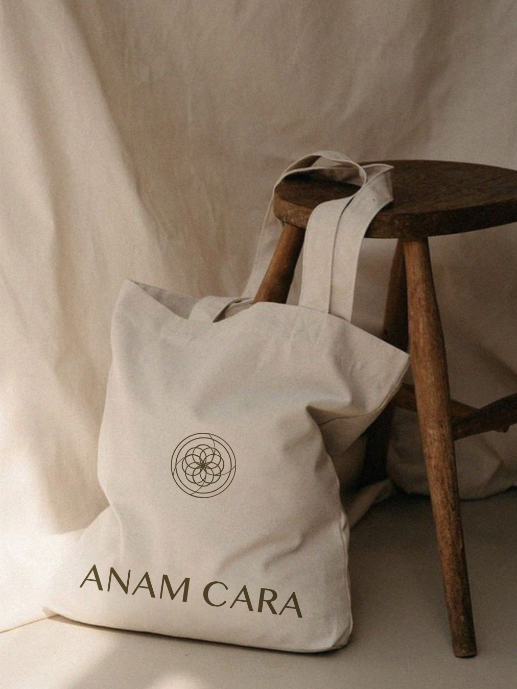
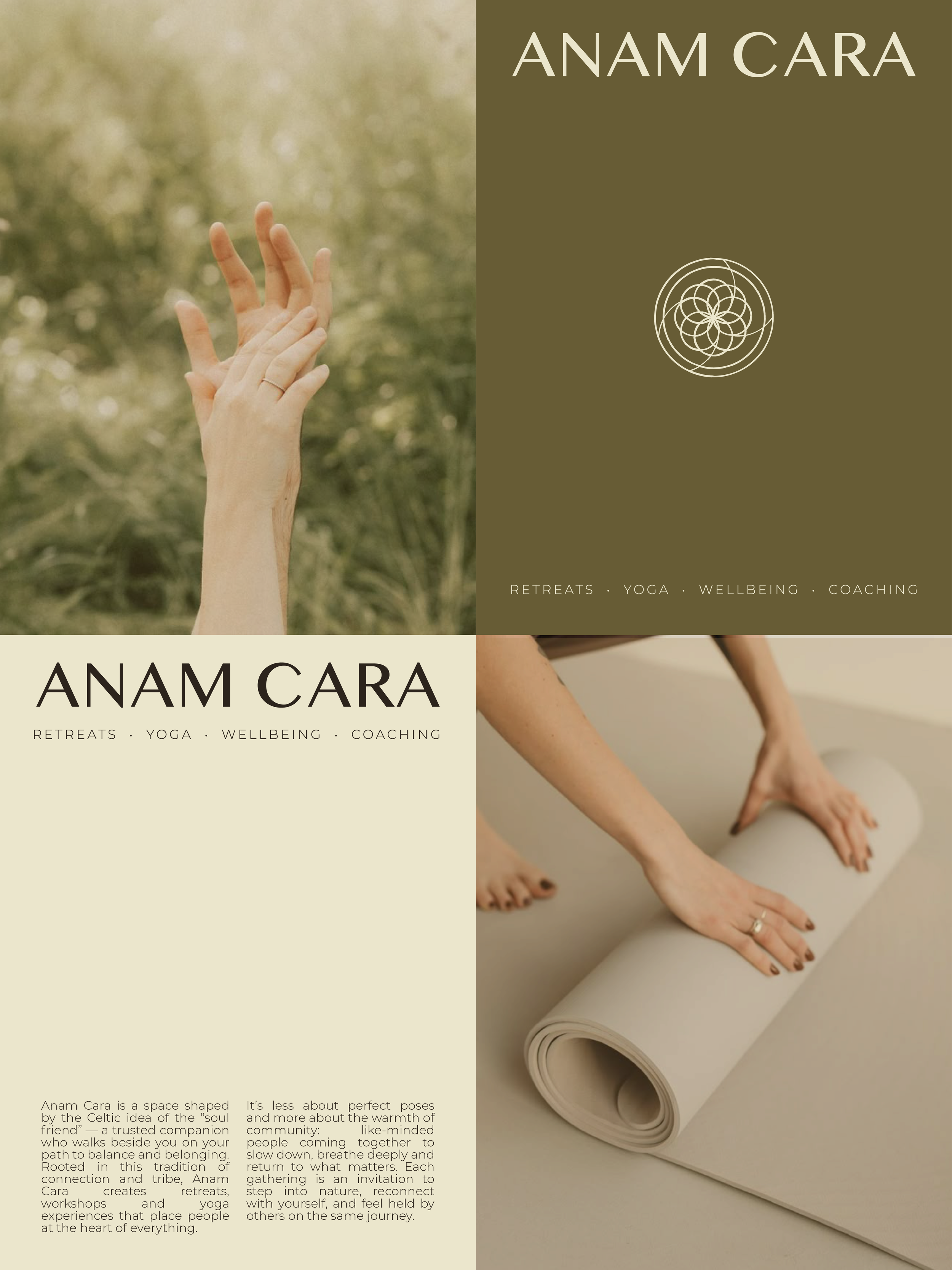
Anam Cara is a soulful space for mindful movement and meaningful connection, bringing wellbeing both into and beyond the workplace. The brand’s name is rooted in the Celtic concept of the “soul friend”: a trusted companion on the path to balance and belonging.
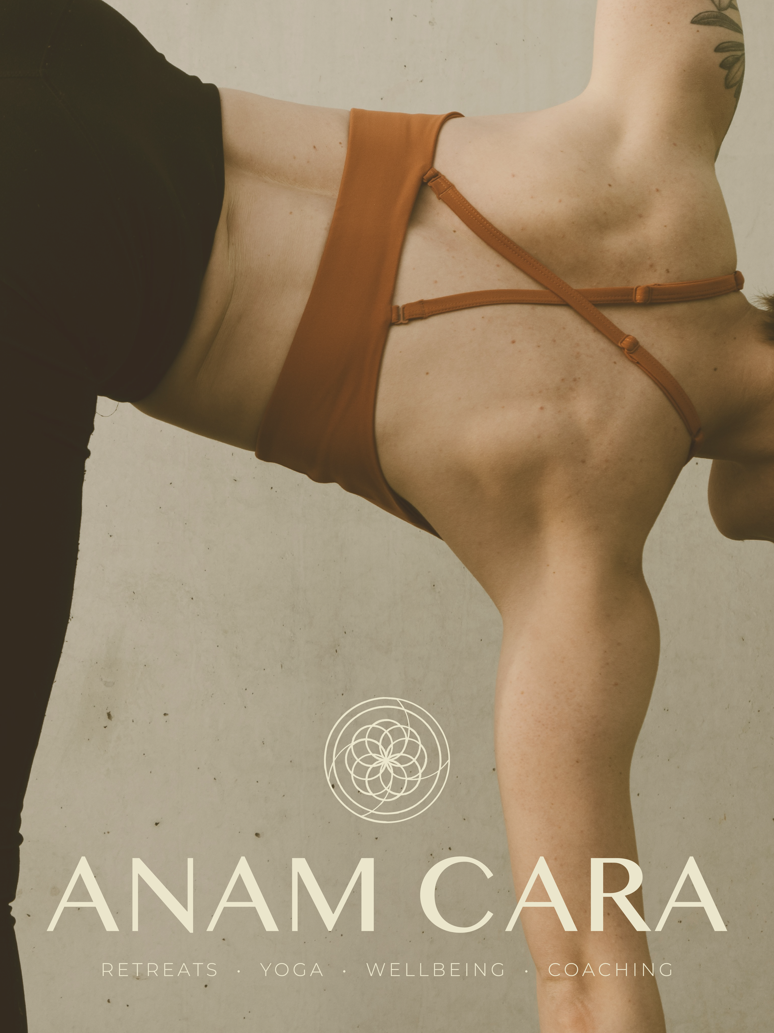
At the heart of the brand is Nicole McMahon-Leske, a gentle and experienced yoga teacher. Through retreats, workshops, and yoga experiences, she creates spaces centred around connection, community, and slowing down.
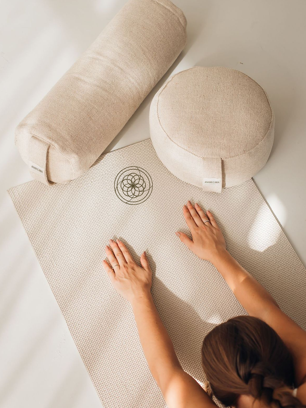
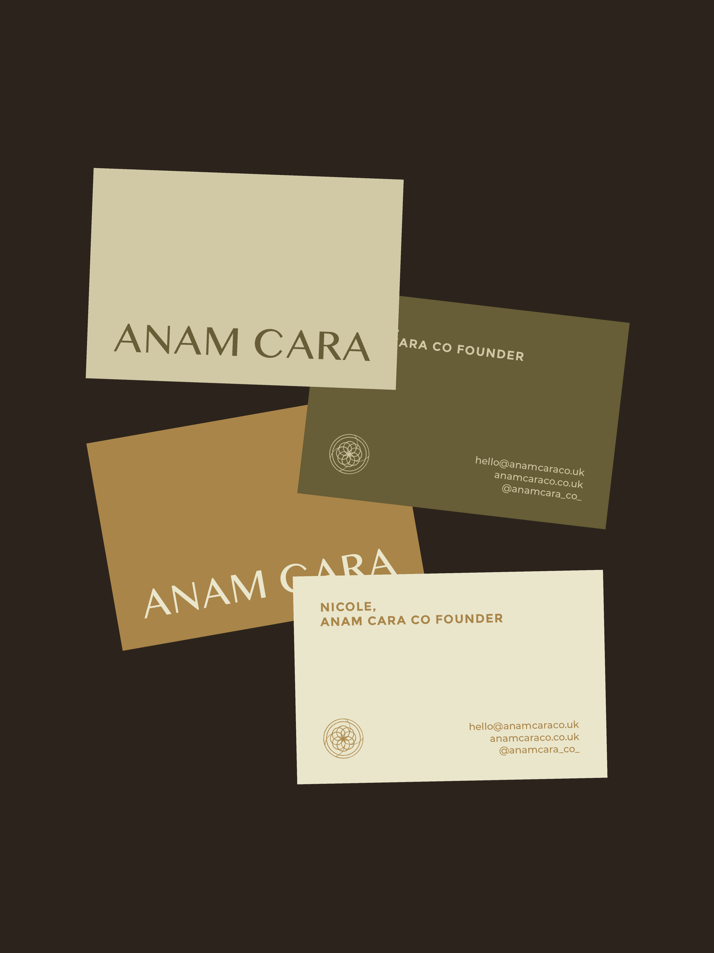
The identity reflects a balance of tradition and modernity. The logotype draws from Celtic fonts with a refined, contemporary feel, while the icon reinterprets a Celtic knot, symbolising connection, continuity, and the ever-changing nature of life. Every element of the icon nods to connection and community: the circular shapes and the intersecting lines, like souls meeting and influencing one another.
Although the brand symbolism is rooted in wellbeing and yoga, the identity also needed to feel flexible and accessible. One of Anam Cara’s core pillars is bringing wellbeing into the workplace, so the visual identity had to appeal to both a yoga audience and a more corporate one without feeling alienating to either.
Anam Cara
Brand Identity
Brand Identity
Logo Design
Art Direction