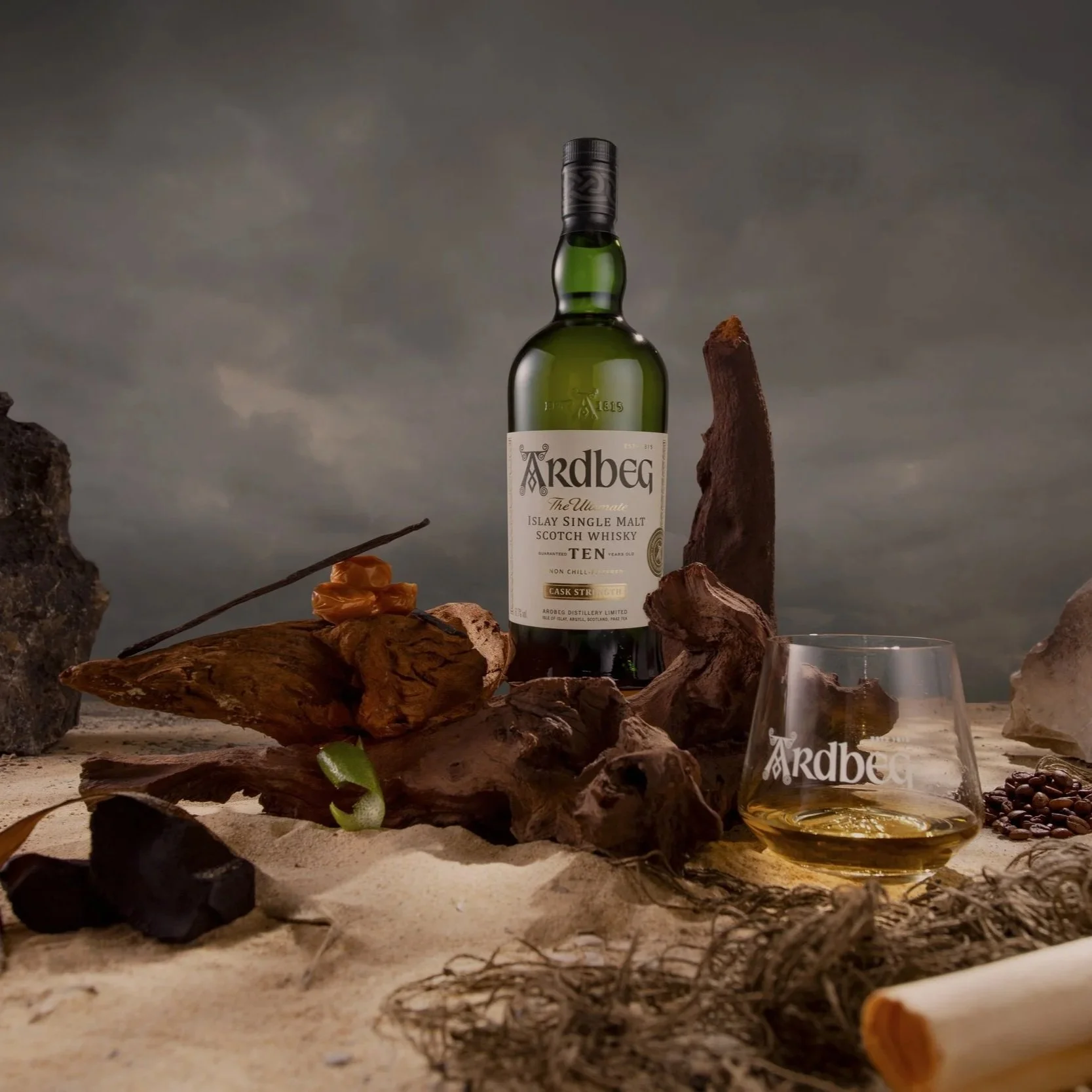
To celebrate the launch of Ardbeg’s 10 Cask Strength — the “Committee’s Most Wanted” expression — I collaborated with the team at Bright Signals to create a series of stylised commercial shots.
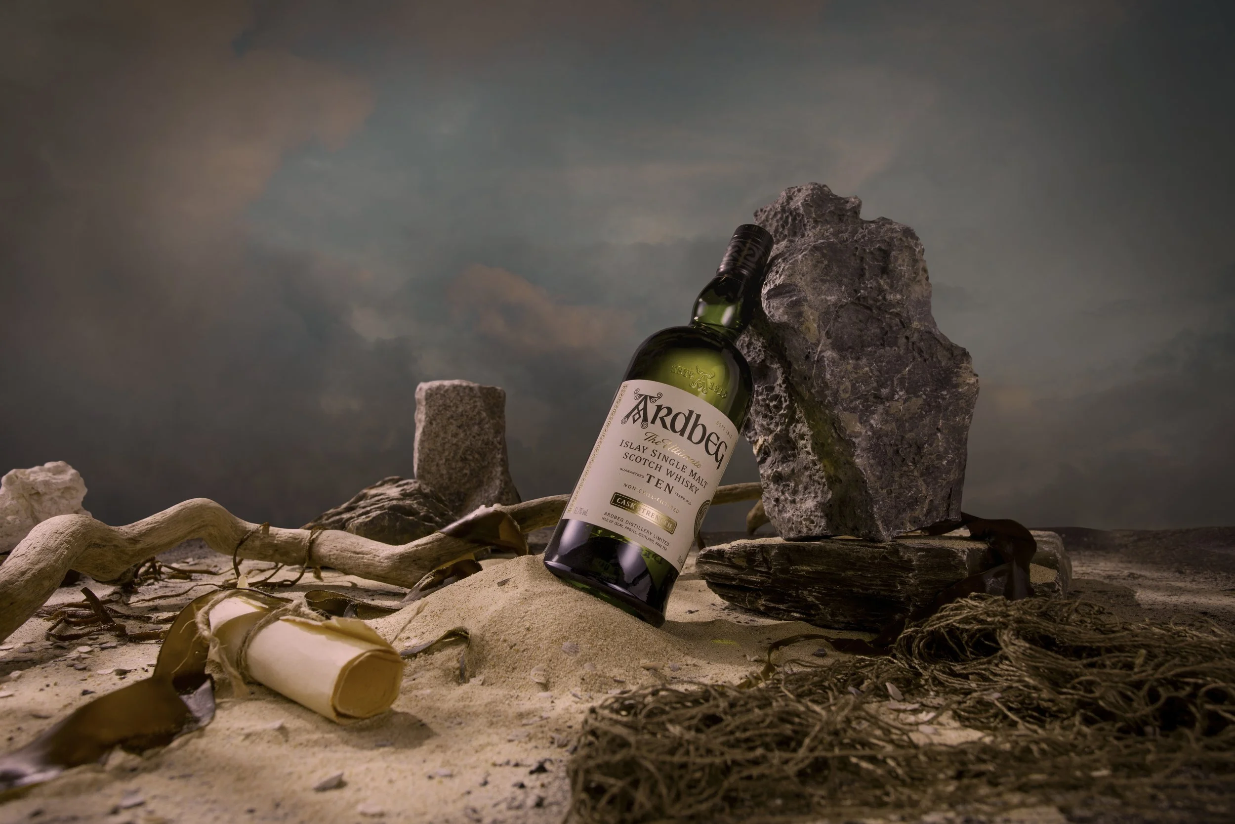
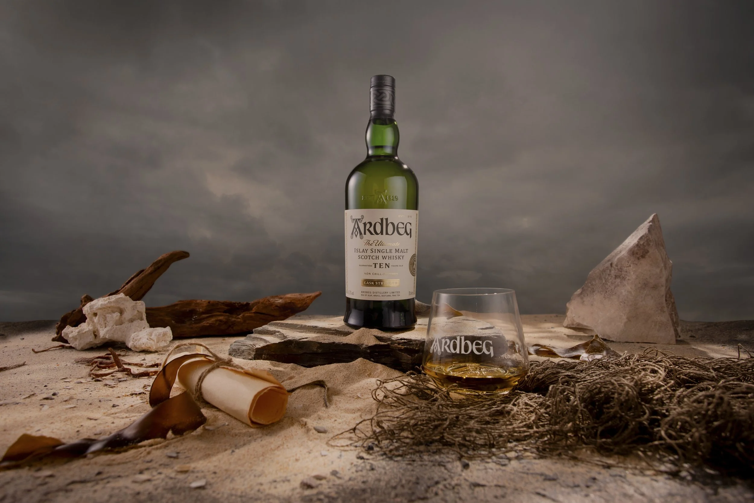
I was inspired by the rumour that the Committee’s calls for this whisky were sent out to sea in bottles, eventually washing ashore at Ardbeg. The visual world takes its cues from that narrative, built around a coastal setting that feels naturally formed rather than staged, the kind of textures and materials you’d expect to find along a rugged shoreline.
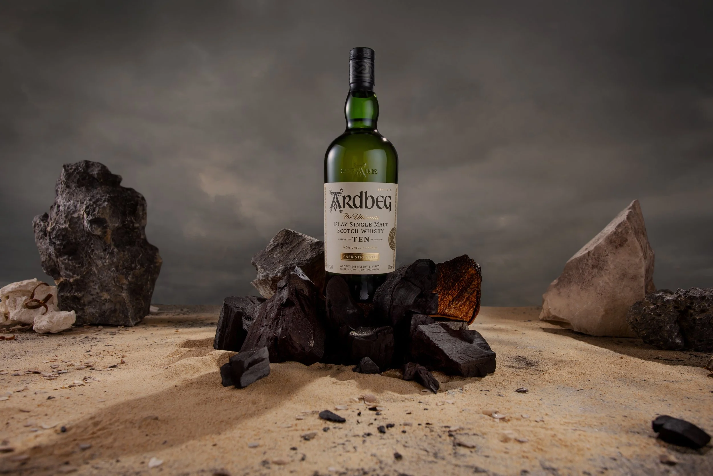
The overall look is tied together through elements such as sand, weathered rocks, driftwood, seaweed, and worn fishing nets, creating the feeling that the bottle has been discovered rather than deliberately placed. The bottle remains at the centre of the composition, grounded within this environment and surrounded by subtle details that hint at messages and notes travelling across the water.
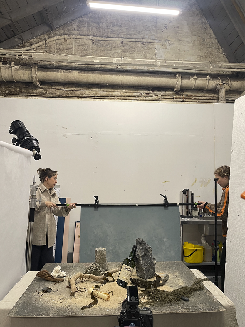
To achieve these shots, I worked closely with Glasgow photographer Clair Irwin, handling prop sourcing, art direction, and lead styling on set. The result was an atmospheric visual world that felt authentic to Ardbeg’s coastal roots.
Ardbeg 10
Cask Strength
Art Direction & Styling
Campaign Creation
Conceptualisation
Art Direction
Prop Sourcing
Styling